

15 Sep Calm by Design: The Case for Interfaces That Don’t Shout
Open any app on your phone and count how many things compete for your attention in the first three seconds. A badge here, a banner there, a pulsing button, an auto-playing animation. Now ask yourself: when did this start feeling exhausting rather than engaging?
You are not alone. And the design industry is starting to take that seriously.
In 2026, the pendulum has swung decisively toward calm interfaces — designs that respect user attention as the scarcest resource. This isn’t minimalism for its own sake. It’s about recognising that users are distracted, operating at reduced focus, and increasingly sceptical of design that feels engineered to manipulate them.
Open any app on your phone and count how many things compete for your attention in the first three seconds. A badge here, a banner there, a pulsing button, an auto-playing animation. Now ask yourself: when did this start feeling exhausting rather than engaging?
You are not alone. And the design industry is starting to take that seriously.
In 2026, the pendulum has swung decisively toward calm interfaces — designs that respect user attention as the scarcest resource. This isn’t minimalism for its own sake. It’s about recognising that users are distracted, operating at reduced focus, and increasingly sceptical of design that feels engineered to manipulate them.
How We Got Here
The story behind the calm interface movement is partly a story about what came before it: the attention economy. For roughly fifteen years, digital product design was shaped by a single implicit goal — keep people engaged as long as possible. More notifications. More autoplay. More infinite scroll. More “dark patterns” — design tricks that nudge users into actions they didn’t consciously choose, like hiding the “reject” button behind three menus while “accept all” sits in bright green.
It is 2026, consumers are more privacy-aware, regulation is tighter, and conversations around ethical data practices are mainstream. And yet every day, users still fall into the same traps — clicking “Accept All” because “Reject All” is hidden, or agreeing to tracking because the copy sounds comforting. Regulators in the EU, US, and elsewhere are catching up with legislation, but the cultural shift in user expectations is moving even faster than the law.
What Calm Design Actually Means
Calm design is not the same as blank design. Calm Design is strategic subtraction — eliminating elements that compete for attention and replacing them with clarity that accelerates decisions. In a calm interface, users don’t hesitate, they don’t overthink.
The clearest trend in UX this year is reducing cognitive load. Gamification is being replaced with calmer micro-interactions, and extravagant motion controls are giving way to strategic ones. Designers are removing visual clutter, identifying new ways to simplify flows, and limiting the number of decisions users need to make in a single session. Interfaces should prioritise white space, visible and easy defaults, and conveniently placed hierarchies of content.
Importantly, reducing the complexity of design does not need to be strictly minimalistic or about reducing aesthetics. A calm interface can still be beautiful, even bold — it just earns every element’s presence.
Motion design is a telling example. Motion in calm interfaces has a job. It doesn’t just look cool — it explains. Instead of asking “How can I make this transition beautiful?” the right question is “What state change is the user missing? What does the system want the user to understand right now?” Every pixel of motion should have a reason. If you can remove it and the interface still functions, it doesn’t belong.
The Business Case
This isn’t just an ethical or aesthetic argument — it’s a commercial one. In 2026, users are overwhelmed by constant notifications, AI-driven content, and decision fatigue. Calm digital experiences reduce cognitive load, build trust faster, and help users feel confident instead of rushed — making calm a true competitive differentiator.
Workplaces that implemented calm technology principles saw a 15% reduction in employee anxiety levels and a 66% improvement in focus duration. And trust, once earned through restrained, honest design, drives something more durable than engagement metrics: retention, referrals, and long-term loyalty.
A Note on AI Interfaces
There is an additional dimension that makes calm design particularly timely in 2026: the rise of AI-powered interfaces. As more products integrate AI agents that act on behalf of users — booking things, summarising things, making decisions — the risk of invisible automation grows. When an AI agent acts on a user’s behalf, each action should be legible and interruptible. Invisible automation increases cognitive anxiety, not confidence. Transparency is not just a nice feature. It is the foundation of trust in AI-native products.
Our Take
There is something quietly radical about designing an interface that does less. In an industry that has long measured success in time-on-app and click-through rates, choosing restraint requires conviction. But users are noticing — and rewarding — the products that treat their attention with respect. The calm interface movement is not a trend in the superficial sense. It is a correction. And as the tools for capturing attention become more powerful, the ethical obligation to use them with care becomes more important, not less.
Sources:
Further readings:
- Mind Coders / Medium – Building Calm Interfaces: Less is More in 2026
- Envato Elements – UX/UI Design Trends for 2026
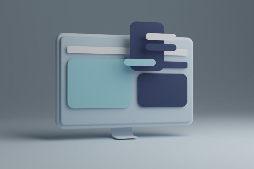
Photo: Kunal Patil at Unsplash
AI Information: We have worked with the AI assistant Claude, who helped us with the research, structuring and content development for this article. All AI-generated content has been carefully reviewed and adjusted to ensure it reflects our understanding and expertise. Although the AI assisted us, we take full responsibility for the content of this article and its accuracy.
Sorry, the comment form is closed at this time.