

15 Aug Bold Colors Are Back — But Not Like You Remember Them
For roughly a decade, the dominant language of premium branding has been one of restraint. Neutral palettes. Whitespace. Understated typography. The look that came to be known as “Quiet Luxury” — whisper-soft non-colours, nothing too loud, nothing too eager. Clean. Calm. Expensive-looking without trying.
That era is not over. But something is shifting next to it, and it is worth paying attention to.
The Pendulum Swings
Colour trends in branding rarely reverse dramatically — they rotate. And in 2026, we are watching the pendulum swing back toward the bold, the expressive, and the emotionally charged. The trigger was not a single campaign or brand launch, but a broader cultural mood: after years of economic uncertainty and visual caution, there is an appetite for optimism. And optimism, it turns out, has a colour.
Fashion led the charge, as it often does. Over the summer of 2025, brands like Jacquemus and Guest in Residence embraced what observers began calling the “Colorful New Wave” aesthetic, drawing inspiration from vintage New Wave cinema — a movement that proved colour could be joyful and refined at the same time. That spirit is now spreading fast, with brands across industries leaning into what some are calling “dopamine-inducing colour stories” that feel fresh, playful, and full of personality.
The data backs this up. Searches for bold, modern fonts are up 65.7% in recent weeks compared to the previous period, while downloads of colourful design assets are climbing steadily across major creative platforms.
What Makes This Different From the Neon Era
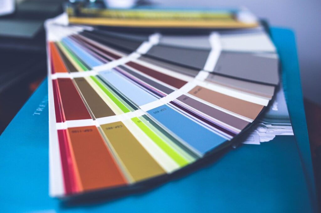
It is worth being precise here, because not all bold colour is the same. The neon moment of the early 2010s was loud for the sake of loud — saturated, flat, and often exhausting. What is happening in branding in 2026 is more considered. Designers are embracing dopamine-inducing brights — electric blues, vivid oranges, sharp greens — but almost always pairing them with disciplined, often neutral surroundings.
One clear example: brands using a single saturated accent colour against a white or charcoal base, letting that one vivid hue carry the emotional weight of the entire identity. The restraint is still there — it has just moved from the colour itself to the architecture around it. As one design observer put it, saturation revival does not always mean chaos. Sometimes it is about letting a vivid colour hit harder through contrast.
Alongside the bold wave, neo-minimalism is also evolving. The lesson from this trend is elegant: minimal does not mean beige. Deep chocolate, sage, or slate can ground a palette while feeling calm and premium. The definition of “refined” is quietly expanding.
The Risk of Getting It Wrong
Bold colour in branding is not a simple switch to flip. There are real pitfalls. The most common: going bold without strategic grounding. A vivid palette that has no relationship to what a brand actually does, who it speaks to, or what it wants to communicate, is just noise. Worse, it can undermine trust — particularly for brands in sectors where credibility and seriousness are core values.
There is also the speed at which colour trends travel in 2026. What feels fresh and original on a runway in June can feel ubiquitous on packaging by October. Brands that adopt colour purely because it is “on-trend” risk looking like they are chasing rather than leading. The most durable brand colour decisions are rooted in something the trend does not provide: genuine brand strategy.
Colour of the Year: A Divided Picture
The annual Colour of the Year announcements offer a useful snapshot of where the industry sits. For 2026, the picture is divided in a revealing way. Pantone chose Cloud Dancer — a soft, open white, associated with calm and a clean slate. Benjamin Moore went the other way with Silhouette, a rich espresso with charcoal undertones. Pinterest’s data-driven forecast landed on a wide spread, from pale glacial Cool Blue to electric Wasabi and warm Persimmon — a set of colours reflecting both the calm aesthetic and the boldness movement simultaneously.
What this split tells us is that there is no single direction. There is a conversation, and smart brands are listening carefully to which part of that conversation belongs to them.
Our Take
Colour is one of the fastest ways a brand can signal change — and one of the easiest ways to get it wrong. The return of bold, expressive colour in 2026 branding is a genuine and interesting shift, but it is not permission to simply paint things brighter. The brands doing this well are using colour strategically: as a point of view, a personality, a position. The ones doing it poorly are just following a trend. The difference between the two is, as always, the quality of thinking behind the design.
Sources:
Read further:
- Envato / Author Hub – Graphic Design Trends 2026
- Envato Elements – 8 Graphic Design Trends Shaping Visual Culture 2026
- Adobe Express – Color of the Year Trends 2026
- Pinterest / AOL – Pinterest’s 2026 Color Trends
Photo: Karolina Grabowska auf Unsplash
AI Information: We have worked with the AI assistant Claude, who helped us with the research, structuring and content development for this article. All AI-generated content has been carefully reviewed and adjusted to ensure it reflects our understanding and expertise. Although the AI assisted us, we take full responsibility for the content of this article and its accuracy.
Sorry, the comment form is closed at this time.